Today's multimodal communication comes in a wide variety of flavors. We'll take a quick peek at some of the familiar ways messages are transmitted to us daily.
Linguistic mode - more than just words on some substrate, text plays an important role in transmitting thoughts and ideas. Font size and shape, copyrighted trademarks and logos are visual landmark's along life's information highway. The big blue letters IBM need no explanation, we know it means computing. However, it is normally the content and not necessarily the text design itself that grabs our attention. The t-shirt's basic design helps send the message clearly. There is no distracting artwork, just the simple statement about math. I received this shirt after withdrawing from math in the fall semester. My seventy-two-year-old-brain was too out of practice to continue. In my case, the shirt's statement is in black and white, with no shades of grey...math is not my strong suit.
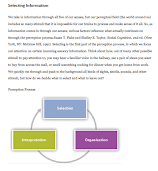
Linguistic and Visual Modes - the layout and design for the perception article is purposeful. Crisp white background, consistent margins, bold heading, double-spaced body copy forced justified on both sides projects a professional, scholarly appearance. The accompanying graphic is colorful, designed to lead the eye in a circular motion indicating the progressive steps in the perception process. The overall look and feel exudes a sense of seriousness, however, the information is conveyed in an eye pleasing manner. Rather than turning the reader away, the layout invites them in to take in the information and then ponder what they've learned.
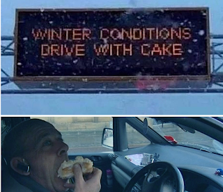
Winter driving conditions pokes fun at the misspelled word care. Like lolcats, the meme is meant to produce a chuckle. Is it real? Who knows? With Photoshop, almost anything is possible. Could a sign like this show up on the highway? It's in the realm of possibility.
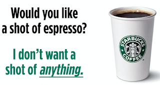
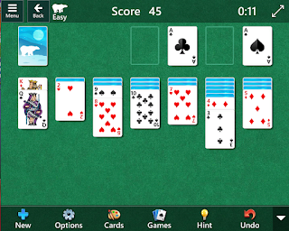
Linguistic, Visual and Spatial Modes - The Starbucks meme combines these three modes. The text and graphic on a white background is spatially balanced and pleasing to the eye. Sometimes less really can be more. Meant to highlight Starbucks recent decision to no longer require vaccinations for employees, the designer uses a clever play on the word "shot." It's not unusual to be asked if you'd like a shot of espresso in your coffee (especially early in the morning). However, intentionally printed in a Starbucks looking green is the thought that not getting a shot at all is preferable.Linguistic, Visual and Aural Mode - Microsoft's Solitaire contains all three. Text is minimal, reduced to telling the player when to start, stop and if they have run out of options and must start again. Visuals consist of a virtual deck of cards identical to those used in real games off line. With each touch of the card, a click is made and when the game is successfully over there is a whole upbeat musical score that plays while the game resets.
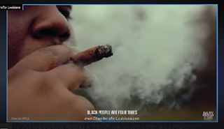
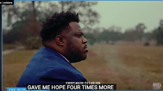
Linguistic, Visual, Aural, Spatial and Gestural Modes- political ads are great fodder for analysis. If one pays attention, one can find all types of techniques, both subtle and obvious, designed to influence the viewer. Unfortunately, Blogger will not let me link the video so I'll show some images of this ad.
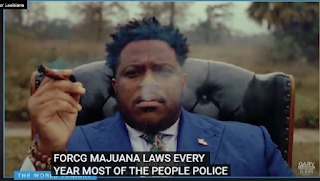
Linguistic - the text is limited to embedded and superimposed (and often misspelled) copy. Gary Chambers does his own voiceover. His tone and script is edgy, in-your-face with perfectly timed inflections for emphasis. The opening scene is Mr. Chambers puffing on a blunt.
Visual - Chambers' only message is the use of recreational marijuana. The video has a raw, grainy feel to it portraying the candidate as a regular guy, not a polished politician. Many of the frames are shot close range, with a I Dare You glare to demonstrate that he means business. He is a serious candidate for the senate seat (hence, filmed sitting on a chair). Aural - The ad opens with strong background music which fades and the sound of a runaway clock ticks under the candidate's voiceover creating a "it's time for action" tone. At the very end, when the shot is framed face forward and Mr. Chambers declares that he approves of this ad, all the background sound is silenced for impact.
Spatial - the entire ad is shot in an open field subtly underscoring the message that Mr. Chambers is an "outsider." Chambers is an ordinary guy, not a part of the establishment. He is about freedom and the wide open space surrounding him amplifies his theme that there are no restrictions needed.
Gestural - Chambers facial expressions and body language all project a determined air. He's not trying to win votes by pretending to be your friend. It's all business. He casually smokes a blunt (one can assume there's something other than tobacco in it). Chambers sits as smoke drifts from the blunt and from his mouth. In the closing frames he looks like a stereotypical politician sitting in the wingback chair and smoking a cigar. All that's missing is a drink in hand. Perhaps he's trying to show that he can fit in to the club.
For anyone interested in watching the ad for themselves, here is the link. Sorry but for some reason it will not play in blogger. https://www.youtube.com/watch?v=DiKjWmW7GUo
As demonstrated above, there isn't a one-size-fit-all approach to multimodal communication. Different modes work better in some situations than in others. The math t-shirt made its point using only text. The textbook chapter on perception has a more serious message, and uses visual elements to make it more appealing to readers. The "drive with cake" meme's photos really tell the story. It doesn't need additional text to explain what the viewer sees. Having music in the background may be fun, but is unnecessary. The Starbucks meme has a slick, professional look in keeping with the Starbucks image. Except for the message, visually it could easily pass for a real piece of Starbucks corporate imagery.
Microsoft's Solitaire gives the player a good experience with visuals, text and sound in the hopes that one will enjoy the game so much, one will be willing to pay in order to avoid the pesky ads that show up on a regular basis. Finally Mr. Chambers ad, employs all five aspects of multimodal communication in order to produce a most unusual campaign promotion and one that viewers will not quickly forget.
Multimodal communication is all around us and impacts our lives daily. As content creators, the more successful we are at determining which mode(s) work best in specific instances, the higher our success rate in grabbing others attention, and getting them to act. And as consumers, knowing the methodologies employed can help us analyze what we see and evaluate its impact and validity.
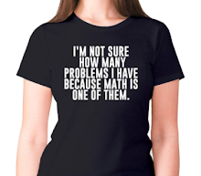
The simplicity of the t-shirt design you received, with its straightforward statement about math, effectively communicates your personal experience and feelings about the subject. The absence of distracting artwork allows the message to be clear and direct.
ReplyDeleteCheck out my new post!